On the 30th April, Erling Haaland equalled Alan Shearer’s record for the most goals scored in a Premier League season – with six games still left to play. With this, he became the first player to score over 50 goals in a single English top-flight season since 1931.
It has been a remarkable season for the 22 year-old, who is still in with a chance of winning the continental treble, with a Champions League semi-final and an FA Cup final still to play.
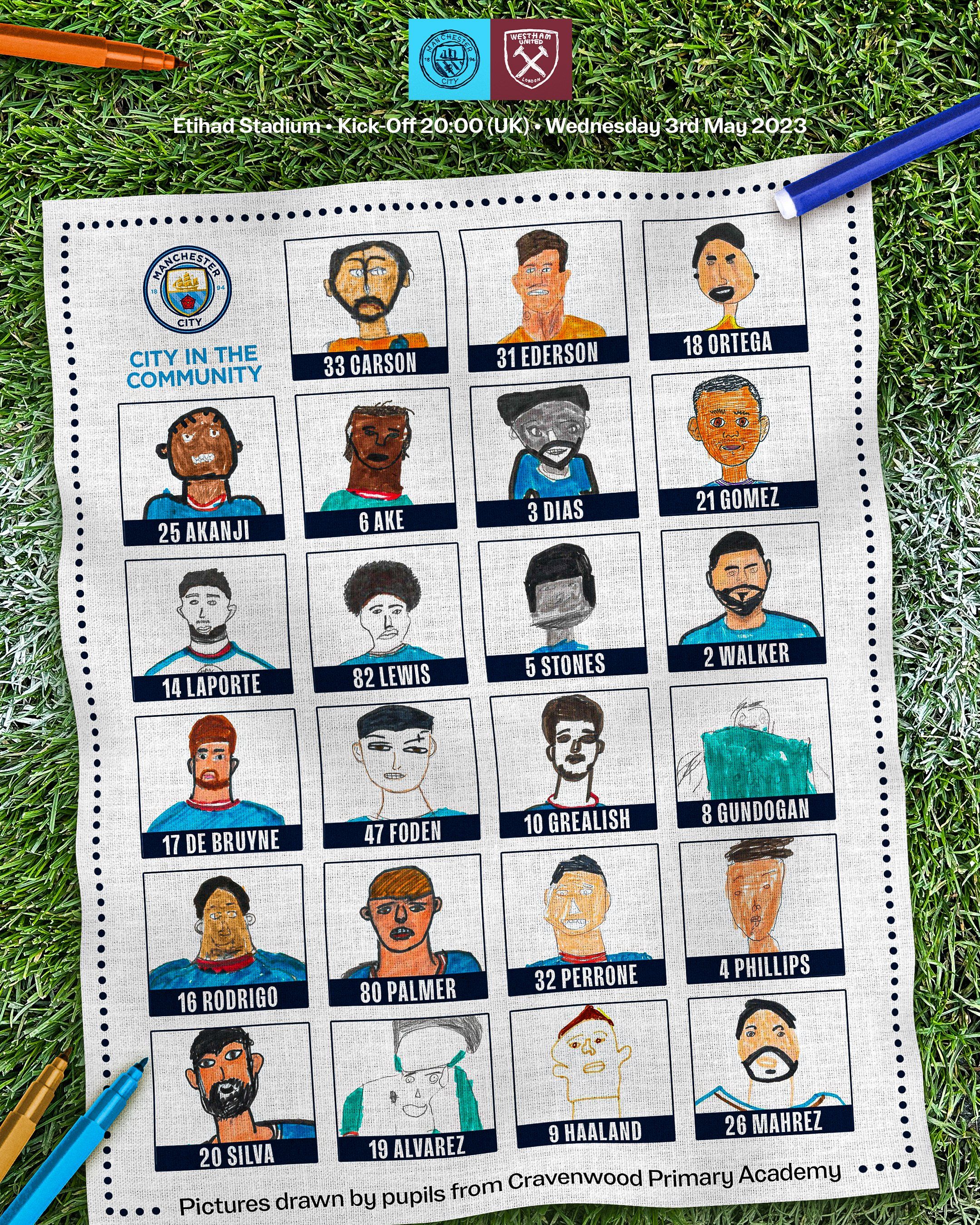
Haaland’s quality, stature, and unique personality has made him quite the asset for Manchester City. But the most engagement on City’s Twitter had nothing to do with his history making season – instead, it was some drawings by pupils at Cravenwood Primary School in Manchester.
As part of the club’s charitable ‘City in the Community’ project, pupils at the school were tasked to draw portraits of the players. City’s media team utilised these images on Twitter to turn the concept of what live match coverage could look like on its head – using the drawings for each goal they scored in their match against West Ham on Wednesday.
For context on how successful this campaign was, when Haaland scored his record-breaking goal just days before, the club’s tweet got just under one million views, and around 18,000 likes. In comparison, the tweet announcing Nathan Ake’s opening goal against West Ham (complete with a lovely drawing by Aleana from the school) got almost 11 million views, and over 130,000 likes.

The drawings immediately stood out on my Twitter feed. A shiny, global brand publishing unpolished, naïve drawings gave the impression of authenticity. Hand drawings have a rustic and appliquéd offline appeal, which evokes feelings for nostalgia and innocence.
Though a similar tactic could be employed by any brand to replicate City’s success – there are other approaches with design which could produce a similar impression. Fundamentally, the drawings make Manchester City appear human – which helps to shed the brand of its corporate image. The human qualities are further accented by the juxtaposition of the digital (Twitter) and the analogue (the drawing).
What if your website was handwritten, hand drawn? What if a 404 page was just a scribbled-out homepage? What if your ‘meet the team’ page was populated with felt-tip caricatures of your workforce?
To be clear – I don’t support Manchester City. In fact, I actively dislike Manchester City. They are owned principally by Sheikh Mansour, the deputy prime minister of the UAE – a country well known for its poor record on human rights and press freedom. The state’s vast sovereign wealth has provided City with the deepest pockets in world football – able to outspend any competing club.
The UAE’s vast wealth is largely from oil production – and its involvement in the oil cartel OPEC is partly responsible for recent strains on the cost of living. This adds a level of perversion to the innocent naivety of the drawings by the schoolchildren – and is arguably another example of ‘Sportswashing’, a tool used to take our minds off corruption and human rights abuses.
Yet, I found myself liking the tweet of Ake.
Though the campaign was charitable, it has also boosted City’s stature as a global brand. The club is more than aware of the public’s perception of its owners, and the ‘bad money’ that finances the club. As such, their branding must be better than other clubs – they won’t gain fans without a well thought out brand strategy to sweep any moral concerns under the rug.
In the same way one can respect but loathe an old ad campaign for Marlboro or BP – we must learn lessons from companies with less than spotless reputations. These types of companies have reams of bad press written about them, and so they must work the hardest to run original and creative campaigns that have a lasting impact on their audience.
Our perception of Manchester City’s brand as ‘corporate’ can be distorted by the colourful inaccuracy and youthful wabi-sabi of the drawings into something ‘human’ and ‘authentic’. Perhaps all brands should be doing a little more doodling and a little less thinking.
James Wemyss is an Account Manager at ThreeTenSeven.