Today we focus our attention on ‘feminine hygiene’. In itself, this has become a rather controversial term, suggesting as it does that women’s bodies are somehow in need of constant cleansing. This scrutiny of the language, both verbal and visual, around periods and associated products has led designers and marketers to challenge previously established norms and create brands that genuinely speak to the needs of women. It's about time.
So here we go. This week:
– Straight talk around period products
– Seeing red
– Rebranding period care
Period progress
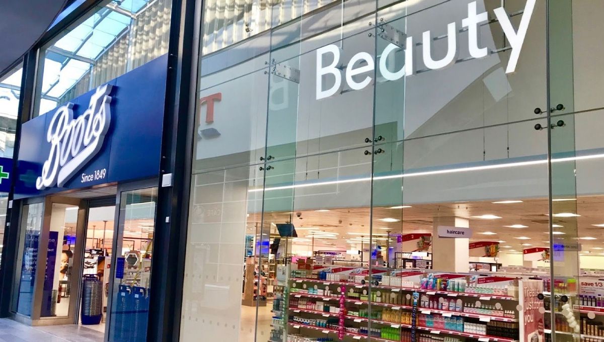
Let's face it, women don't go shopping for 'feminine hygiene products'. They go for pads, towels and tampons – in short, for period products. Recognising this obvious consumer truth, UK retailer Boots has announced its intention to change signposting on its website and its app to say, 'Period Products'. There are plans to change signage across its high street stores as well.
Announcing the move in its Beauty Trends 2022 report, James Kerruish, Beauty Director explained:
“When it comes to periods, we know retailers can play an important role in changing people’s perceptions, including the words we use to describe products. We are proud to be implementing this change at Boots, starting with removing words like 'hygiene' and 'sanitary' and much more proudly saying ‘Period Products’. Period products are essentials, and we want to ensure our customers can find and access all the products they need with ease.”
Sarah Madden, our Senior Designer, says:
“It’s about time for some straight talk. Long gone are my awkward teenage years, when I would ask a very trusted girl friend ‘you got anything for, you know…’ *stares* ‘You know… an emergency flow?’ under my breath in between class. Glad to see society is maturing in this department the same way a lot of women do. I hope this straight talk encourages a positive period talk culture for young girls today and in the future.”

Seeing red
Turning Red, the latest animated offering from Pixar Studios, has broken new ground by portraying its central character experiencing her first period. While the film has been widely praised for its openness around the subject, at the same time it's provoked a backlash in some quarters for being 'inappropriate' for a younger audience. But, how inappropriate can it be if a large percentage of the younger audience watching the animation will grow up to have periods themselves?
It's worth noting that the film isn't just about the onset of periods. It follows the fortunes of Mei Mei Lee, a red panda on her journey through puberty so it's also about family, friendships and an adolescent girl's struggles with her own identity. Turning Red is directed by Domee Shi and is the first Pixar film to be directed entirely by a woman. It is streaming now on Disney+.
Ruby Glover, our Senior Developer, says:
“It’s great to see the topic so openly portrayed in media aimed towards young people. I remember learning about periods for the first time as one of many nervous and embarrassed girls in a group setting at school. Hopefully this kind of media and others like it will encourage more natural conversation at home, where a kid can feel more confident to ask questions.”
From period to self-care
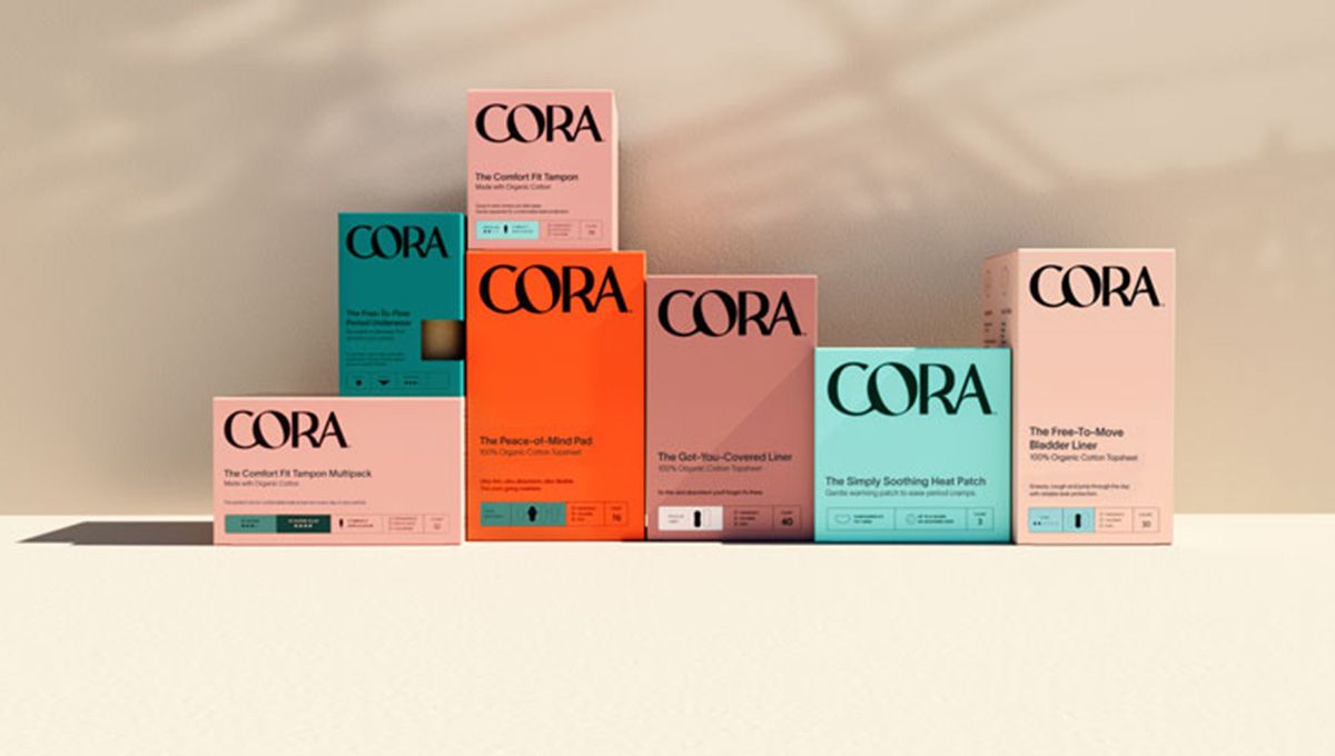
Period care and wellness brand Cora this week unveils its new brand – more emotionally-driven and more closely aligned with self-care.
Cora brand VP, Andrea McCullochsays:
“We want to evolve period care to feel more like self-care. Branding inspired by skincare and beauty packaging worthy of belonging on your bathroom countertop.”
Cora's in-house creative team worked with Mother Design in London to create the new brand identity which covers a new wordmark, packaging, tone of voice guidelines and a renewed positioning. The approach, according to the design team, was to suggest comfort both at a product level but also on an emotional level. The new logo uses a bespoke typeface to convey authority yet feels human and denotes comfort through its curves. The earthy palette is intended to differentiate Cora from the plethora of pastel products on shelf; at the same time the colour system has a practical purpose, reflecting different levels of absorbency.
The new branding allows Cora to champion consumers’ wellbeing and to celebrate the idea that women’s bodies and experiences are unique and ever-evolving.
Chris Skelton, our Creative Director, says:
“It’s great to see a brand pulling out all the stops to make periods more accessible. From the packaging through to the photography, video content and website, everything comes together harmoniously to create something that feels strong and empowering, yet doesn't take itself too seriously. That's just the stuff to get people talking more openly. I could argue that the overarching aesthetic feels like it's riding a trend wave, but to be honest, I'm a fan of anything that moves this historically awful looking category into the 21st century.”