Northpoint: Brand identity
Raising the profile of mental health and therapeutic services across Yorkshire

The challenge
Northpoint is a charity dedicated to delivering a range of mental health services across the West Yorkshire region. They provide counselling and therapeutic services directly to those who need support with their mental health and wellbeing, and their services are typically sought out by commissioners such as regional NHS Integrated Care Boards (ICBs) and Local Authorities.
The landscape for mental health services is complex and competitive, with a range of organisations, local and national, offering similar services. Northpoint Wellbeing had already done work to define their strategy for the future, but it became clear that the brand as it stood wasn't working hard enough to differentiate the organisation within their sector. Northpoint was, and is, a big player, covering a large area of the country. But they weren’t presenting themselves as such. We were asked to carry out a thorough review of the Northpoint brand with a view to levelling them up in the eyes of their audiences.
Our approach
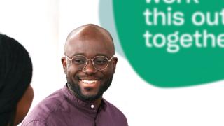
We embarked on a process of deep discovery and analysis, working with key stakeholders to define the principal audiences, stress testing the existing strategy and levels of ambition, and auditing the current brand alongside competing providers. From this stage of discovery, a key insight emerged. While many similar organisations offered a range of support services, covering housing and employment for example, Northpoint by contrast concentrated exclusively on mental health and wellbeing. This supported their position as true experts in their field and led to a confident new proposition reflected by the line, 'Mental health. It's what we do.' We also recommended that they change their name from Northpoint Wellbeing to Northpoint to better communicate their scale and standing within the sector.

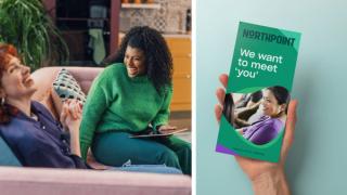
Through a series of persona workshops we were able to profile Northpoint's key audiences and, on that basis, create a messaging framework and a tone of voice that would allow them to address the needs and priorities of triaged users, commissioners, partner organisations, professionals and potential recruits.
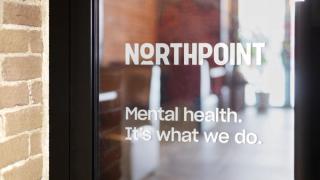
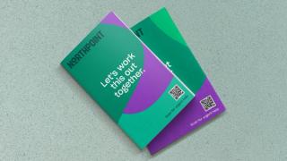
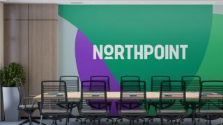
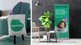
Our review of competitors highlighted a 'colour gap' in the spectrum of brand colours and an opportunity for them to own the colour green – an appropriately calming shade for an organisation with a clear focus on mental health. Northpoint needed to feel human-centred and caring, but also professional, trustworthy and experienced – equally engaging to commissioners as well as service users. Photography was therefore a key component in the identity helping to strike this balance. We also wanted to bring some personality to the brand through the redesigned logo, typography and the introduction of fluid graphic shapes, which we named 'moodforms'.
The results
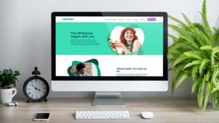
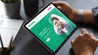
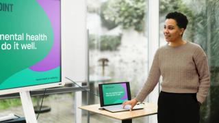
The new identity provided Northpoint with the means to introduce and talk about their new strategy, in fact the supporting strategy document was a key output initially. It was also applied to the new website, designed and built by ThreeTenSeven.
We chose to work with ThreeTenSeven because right from the start we felt they got us and what we wanted to do with our new website and branding. They also understood our constraints in terms of resource, people/time and money.
The process we went through felt robust and exciting at the same time. They took time to understand us as an organisation, listened well and challenged kindly — from a place of knowledge and experience. It felt like a true collaboration at all times.
The quality of what was delivered in terms of the branding and website has given us increased confidence to talk about the value we bring to this sector. Life is so much easier now we have a strong brand to work with. It has always felt just right.
— Duncan Pearse, CEO, Northpoint


“The process felt robust and exciting at the same time. They took time to understand us as an organisation, listened well and challenged kindly — from a place of knowledge and experience. It felt like a true collaboration at all times.”